CareHub
My Role
UI/UX Designer/Researcher
Tools
Figma, Illustrator, Photoshop
Team
Solo Project
Duration
11 weeks
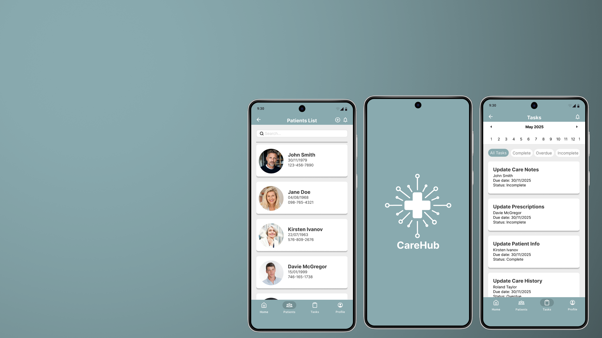
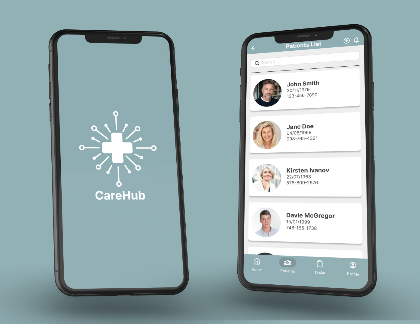
The Product
CareHub is a mobile app designed to enable medical professionals to to document, store, and reference patient records at a primary care offices.
Problem
Primary care institutions are facing issues with how they’re currently storing and referencing patients’ data, including a reliance on centralised databases that are vulnerable to server outages, a lack of offline access when systems go down, slow loading times that hinder efficiency, overly complex user interfaces that reduce usability, and fragmented, segregated systems that make accessing complete patient information difficult.
Goal
CareHub aims to provide a fast, reliable, and user-friendly platform for managing patient records, enabling healthcare professionals to securely access and update information both online and offline, while unifying previously fragmented systems into a single, seamless experience.
User research
To understand user frustrations, needs and requirements, I conducted user research through surveys for my project. My goal was to gain as many insights into the needs and wants of users that I can use to better design my app. From the responses I had received from the surveys I came across these common pain points that users were currently experiencing with the current software they were using.

Complicated user flow
Current EHR are often very complicated, making it hard for users to find information
Slow loading times
Systems sometimes take a long time to fully load and access patient information

No universal database of patients
Currently there isn’t a universal hub that all medical institutions can access to access all patient data

No offline access
Current EHR systems have no access to any databases when either their servers are down or no internet connections are available
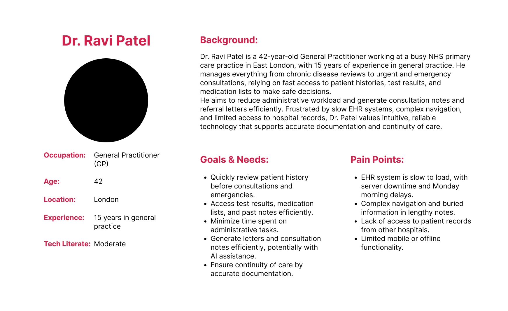
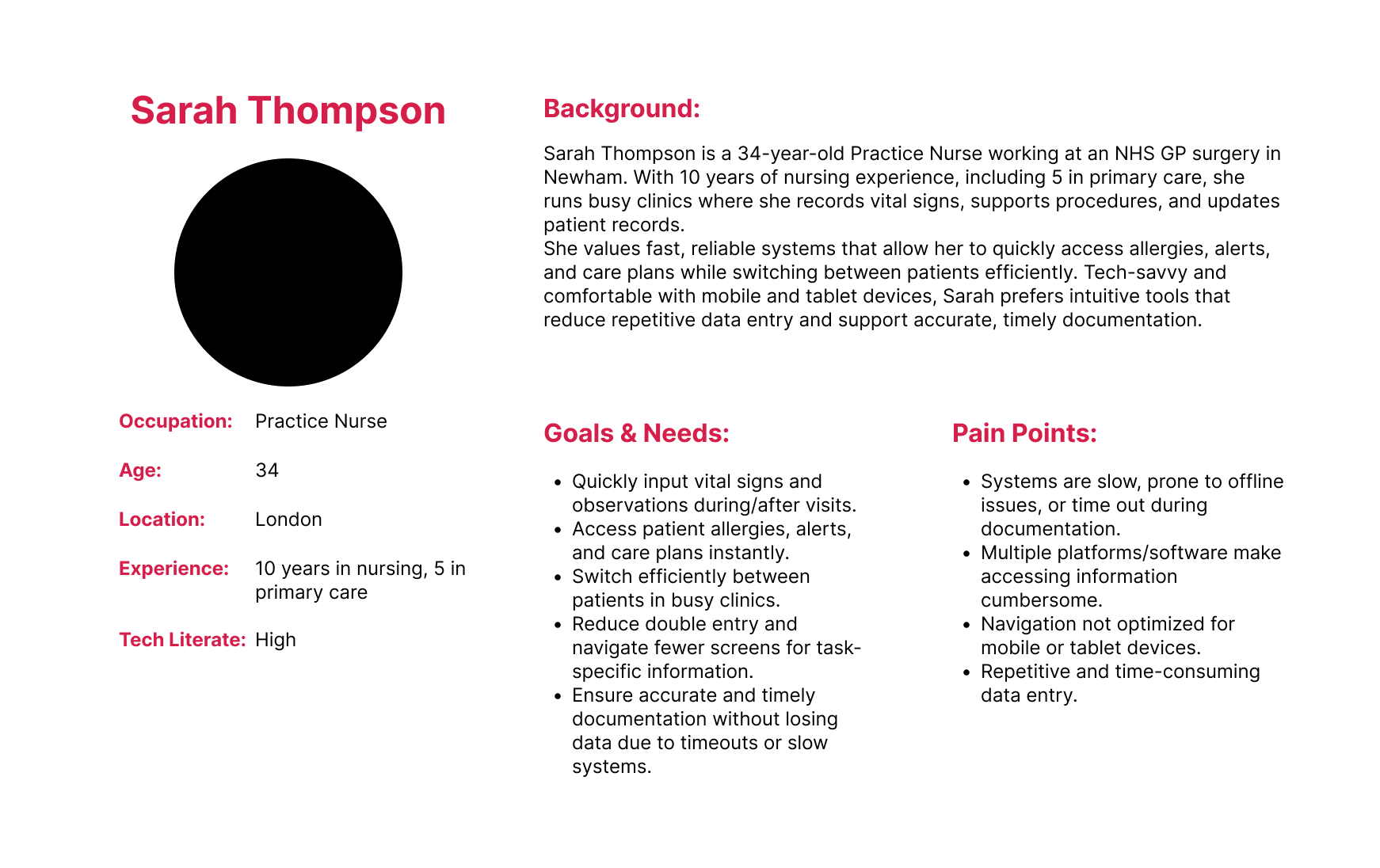
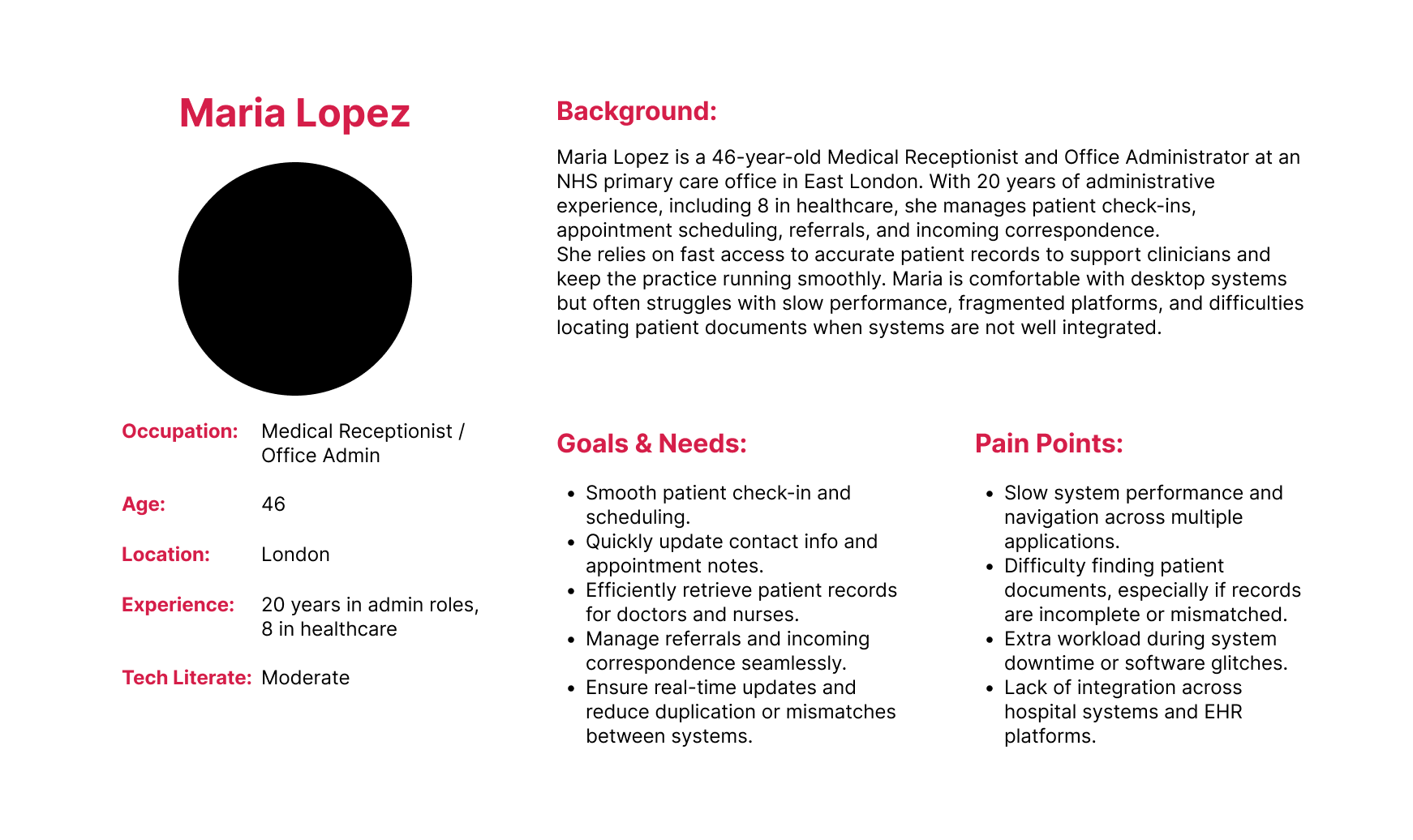
User Personas
Based off the above user pain points and initial user research I created three user personas based on each medical profession within a primary care environment.
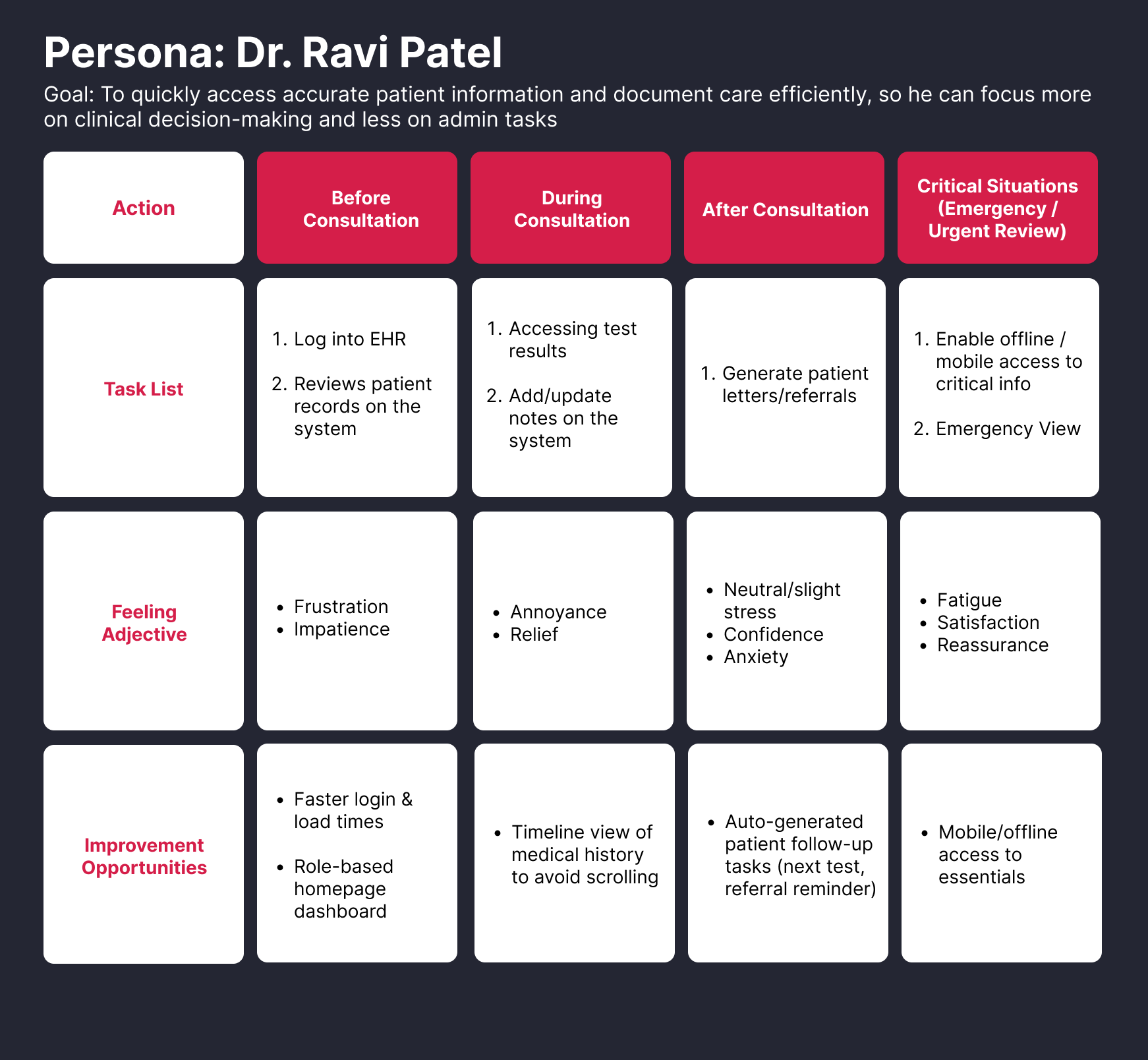
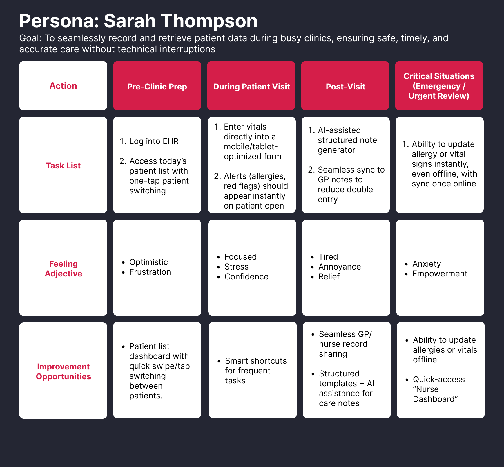
User Journey Maps
I then created user journey maps for each personas
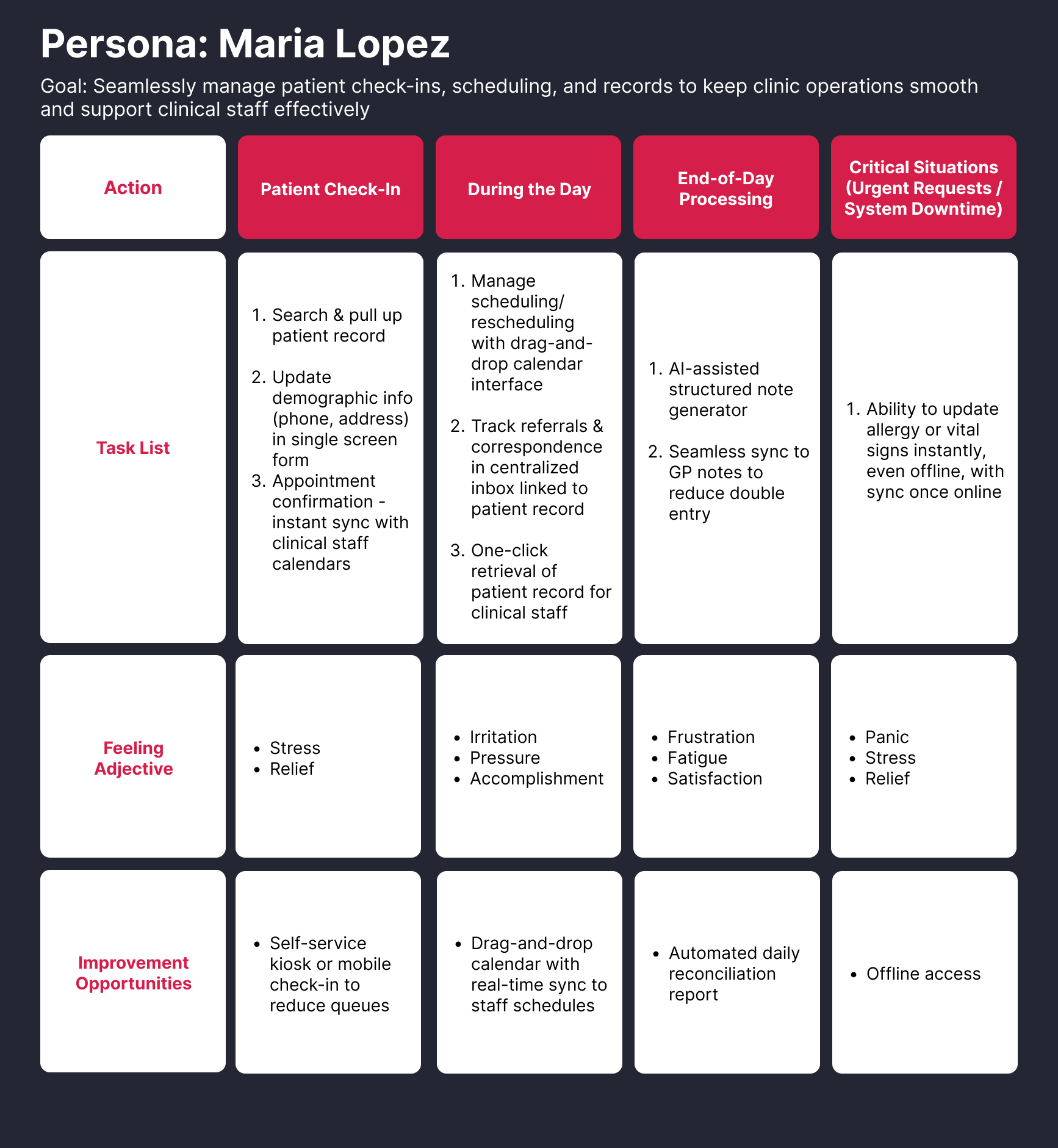
Information Architecture
Lorem Ipsum
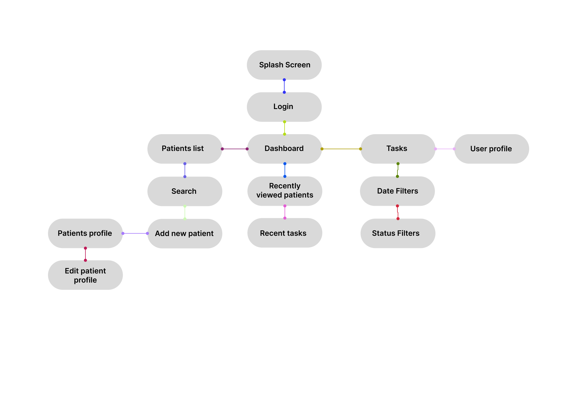
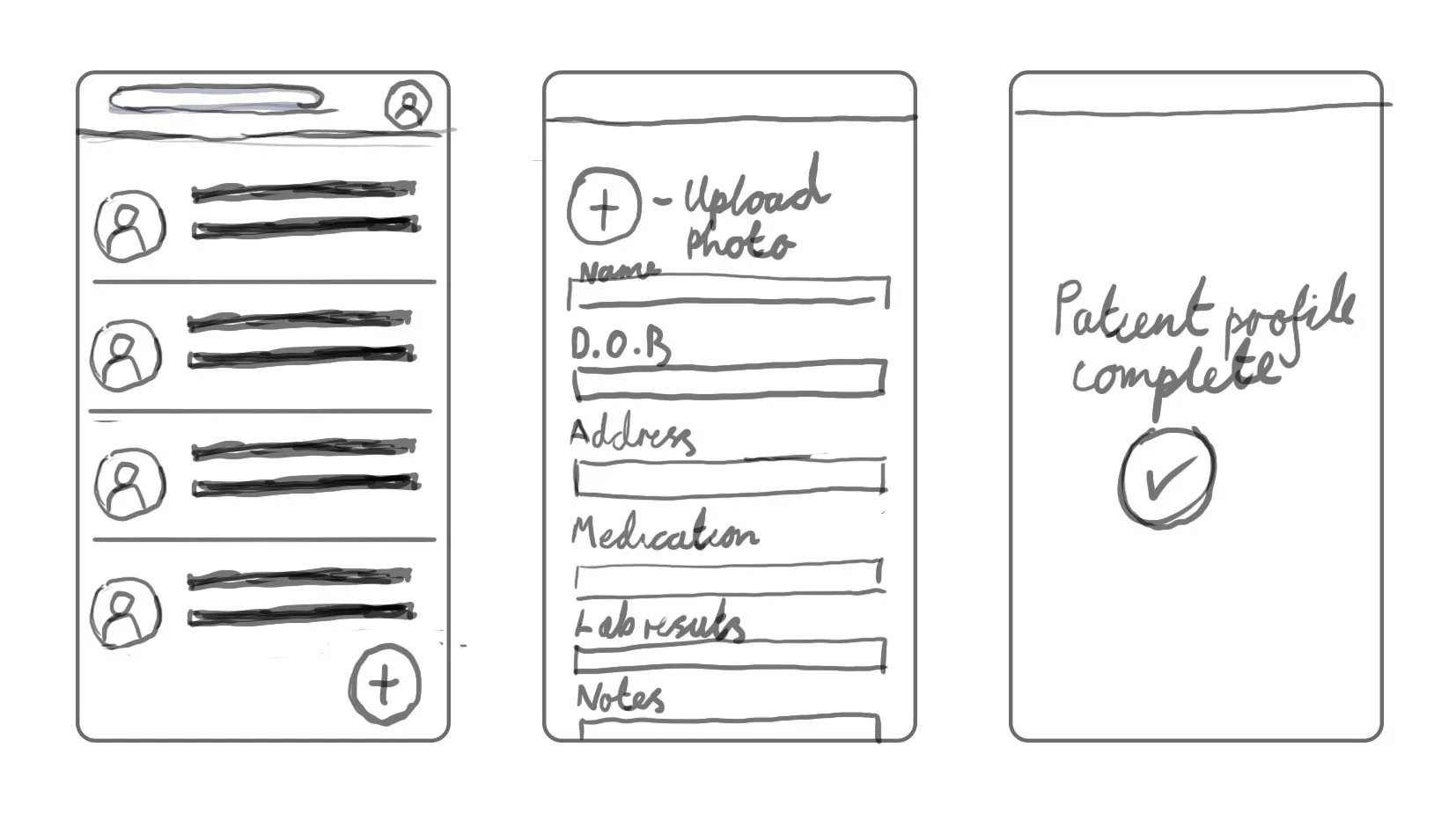
Initial Wireframes
Lorem Ipsum
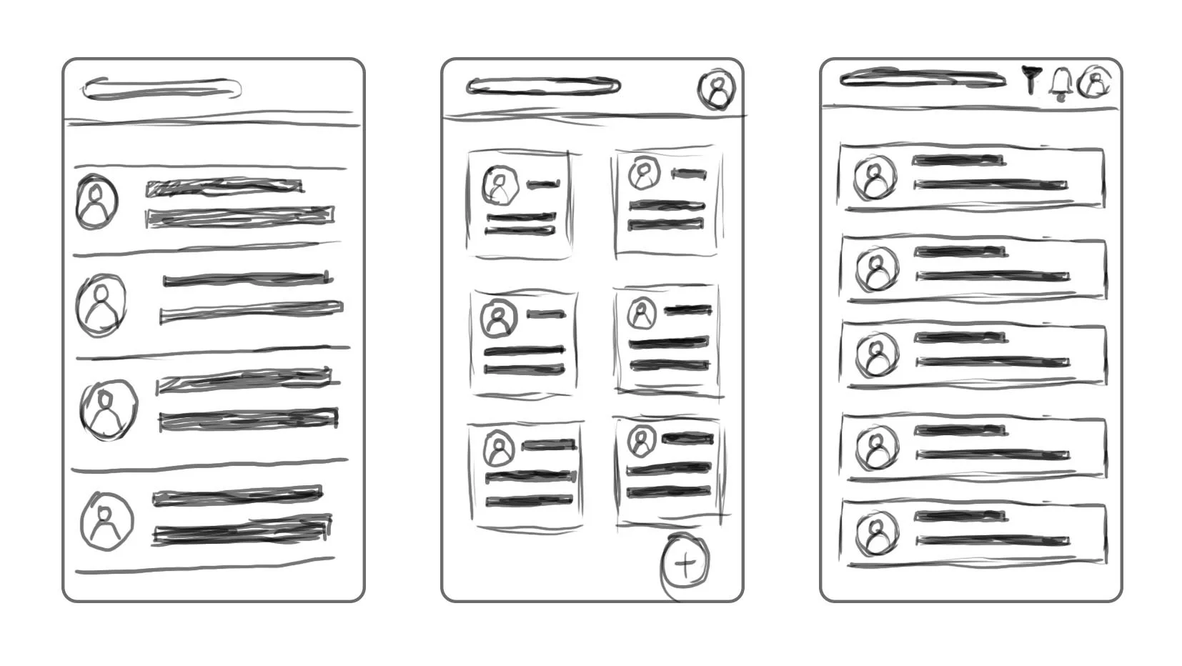
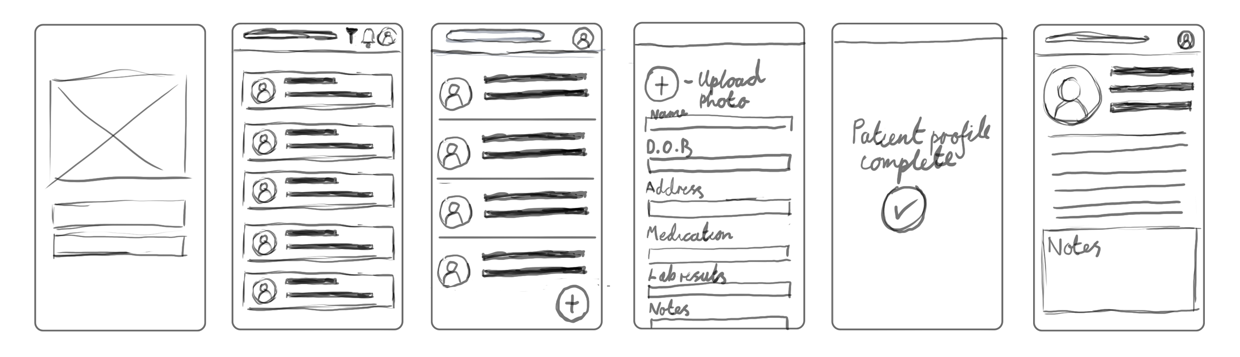
Lo-Fi Wireframes
Lorem Ipsum
I created a low-fidelity prototype from the user flow diagram and wireframes to test functionality before incorporating it into the final design and ensure accessibility for end-users
Usability Study
After the creation of the lo-fi prototype I conducted an unmoderated online user testing with Useberry, I had a sample size of 10 participants. The sample consisted of a mix of healthcare professionals in a primary care environment.
The study was conducted remotely, by using Useberry’s features allowing participants to go through a series of predetermined tasks within their own time.
After receiving all of my result from the usability study, these were the key findings I noticed from the results from the study.
Finding 1
No ‘Forgot Password’ link on the homepage
Finding 2
Users would much rather have the navigation menu to always be visible instead of hidden behind a hamburger menu
Finding 3
User have made it clear that patients key information should be visible on a patient profile card
Finding 4
Not easy creating/accessing notes or tasks
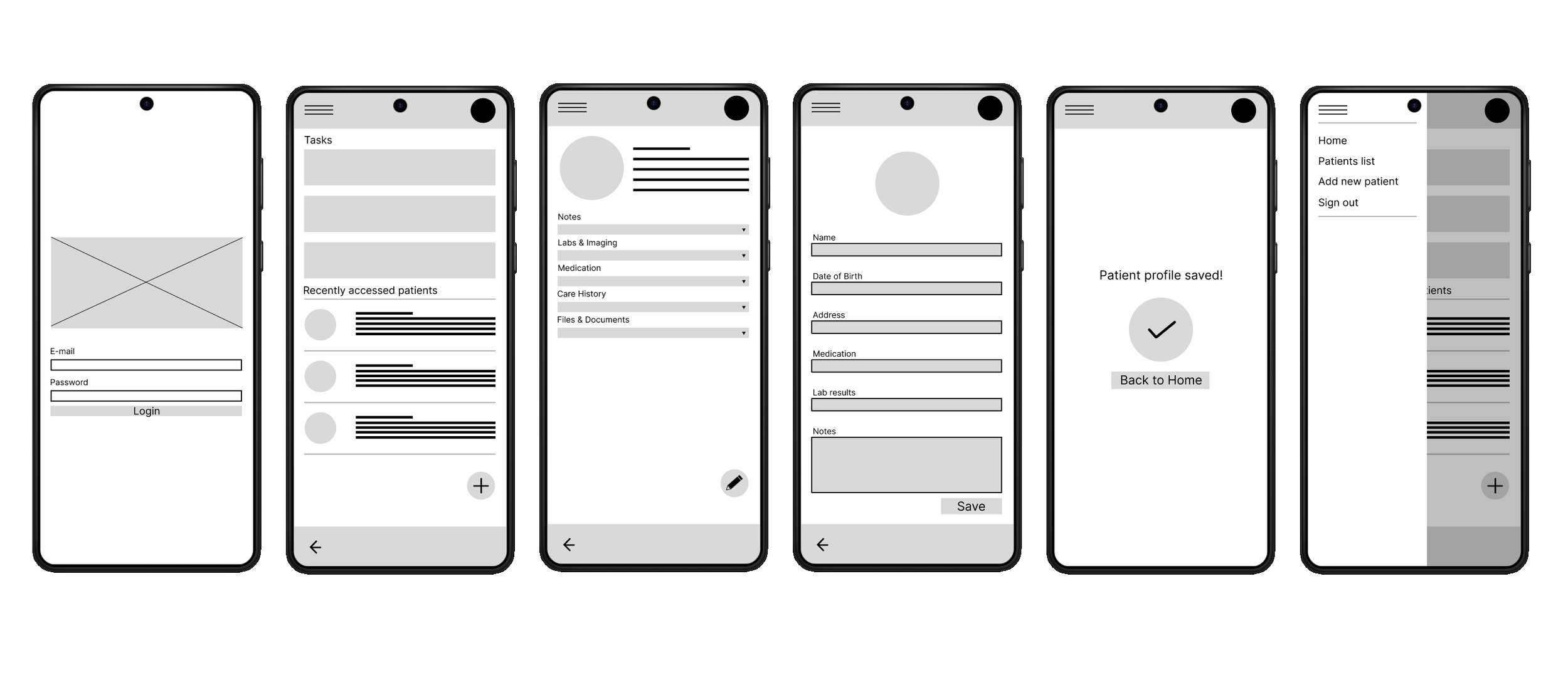
Mockups
Based on insights from the usability study, I applied design changes. These include adding…..
Notes:
Think about adding screens that have clear changes and explain those changes based on the insights you received from the usability study.
Hi-Fi wireframes
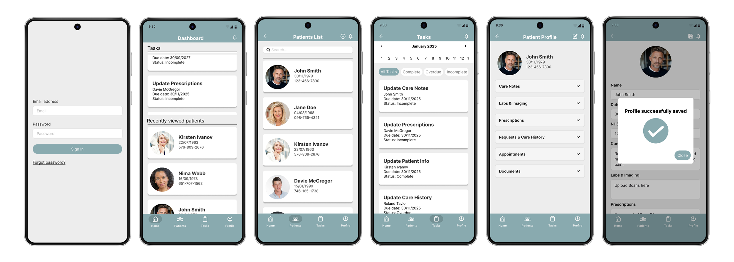
After finalizing the low fidelity wireframes, I worked on creating the final designs with the goal of making them simple and intuitive.
Conclusion
Based on insights from the usability study, I applied design changes. These include adding…..
If I could do this over I would like to try in person interview for my initial user research and research for my usability study