
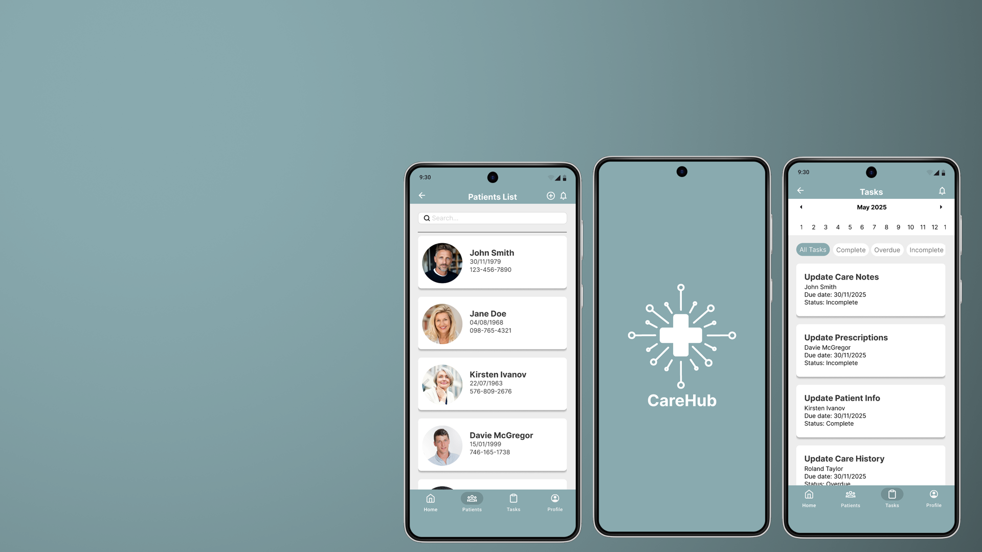
CareHub
My Role
UI/UX Designer/Researcher
Tools
Figma, Illustrator, Photoshop
Team
Solo Project
Duration
11 weeks
The Product
CareHub is a mobile app that enables clinicians to access and update patient records instantly, even without internet, reducing delays caused by fragmented and unreliable systems.
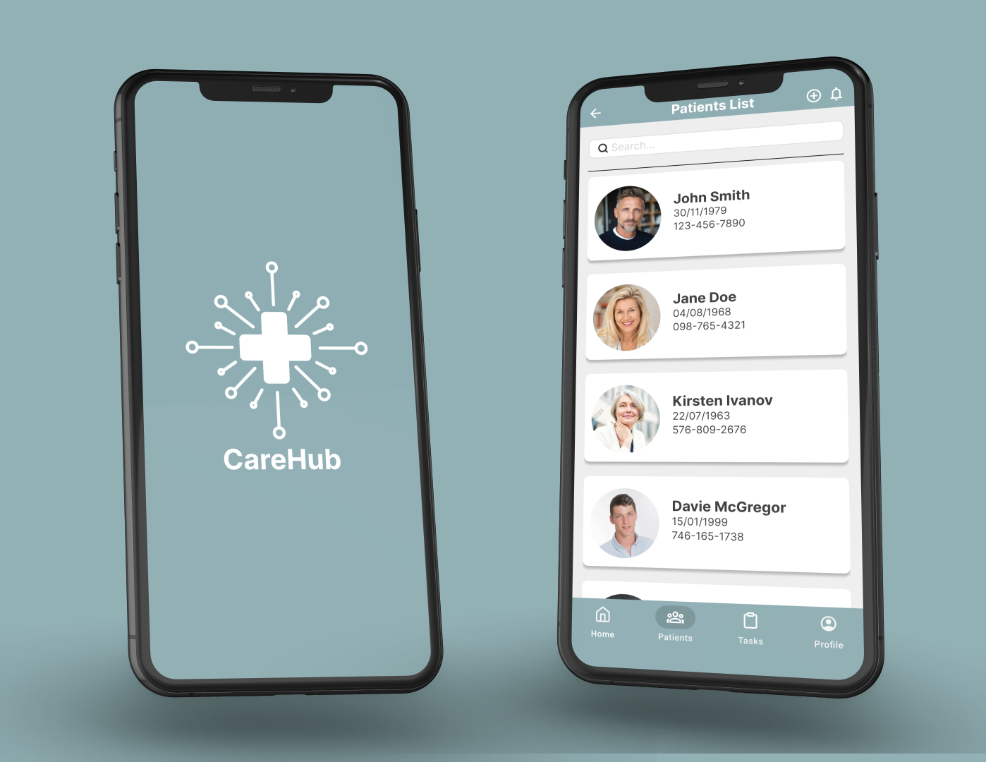
Problem
Healthcare professionals rely on fragmented, online-only systems that:
Fail during outages
Slow down access to critical patient data
Increase cognitive load in high-pressure environments
Design Objectives
Enable offline-first access to patient data
Reduce time to retrieve key patient info
Simplify navigation for high-pressure environments
Consolidate fragmented records into one view
CareHub aims to provide a fast, reliable, and user-friendly platform for managing patient records, enabling healthcare professionals to securely access and update information both online and offline, while unifying previously fragmented systems into a single, seamless experience.
User research
To understand user frustrations, needs and requirements, I conducted a survey with 12 healthcare professionals, including Doctors, Nurses and Administrators, to understand how current EHR systems impact their daily workflows. The goal was to identify the biggest barriers to accessing and managing patient information efficiently.

Inefficient navigation
Clinicians struggle to locate critical patient information quickly due to multi-step navigation and cluttered interfaces.

Performance issues
Slow loading times delay access to critical patient data, increasing friction during time-sensitive decision-making.

Fragmented data systems
Patient data is fragmented across multiple systems, making it difficult to access complete medical histories in one place.

Lack of offline access
Users are unable to retrieve patient data during outages or connectivity issues, impacting reliability of care.
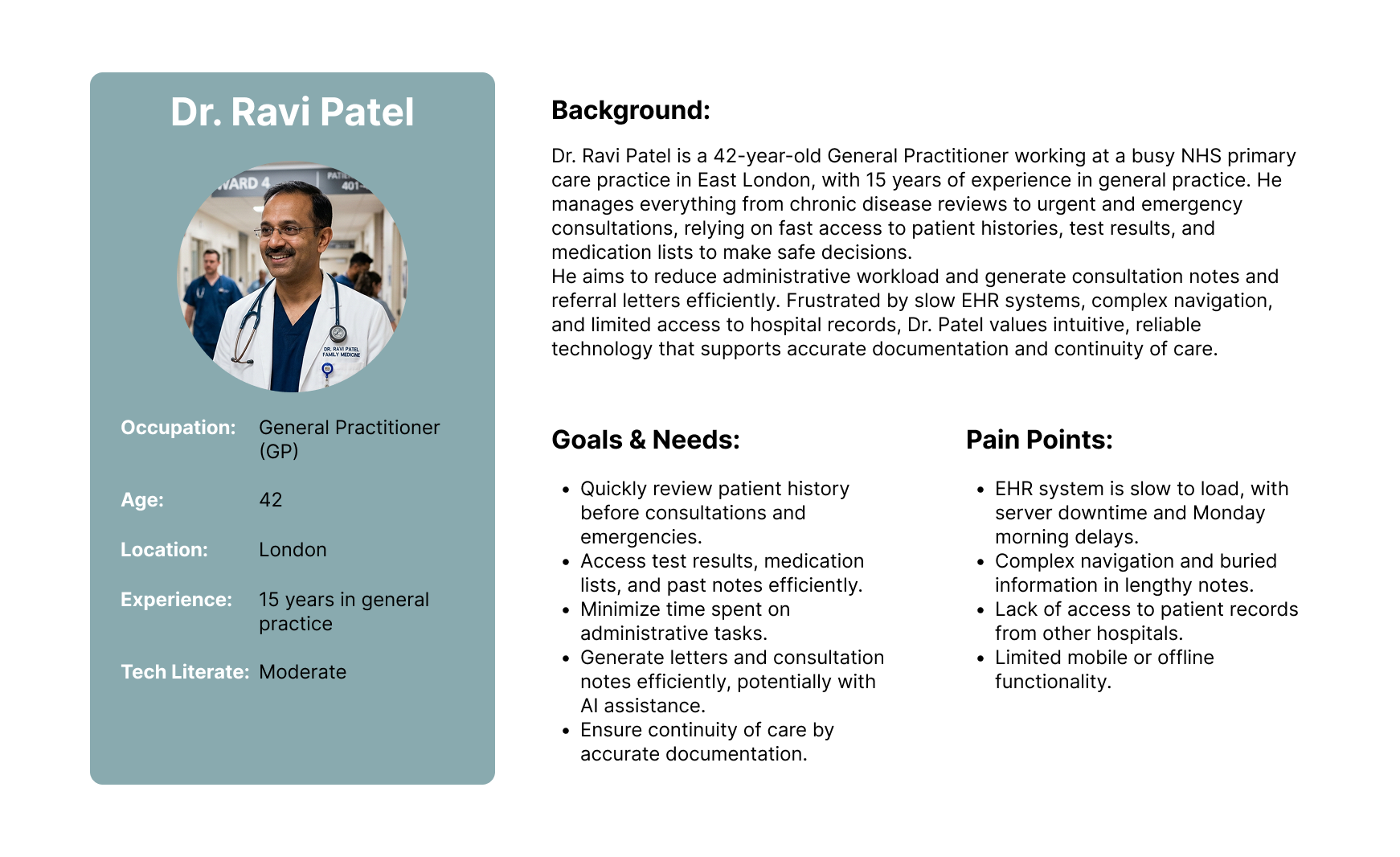
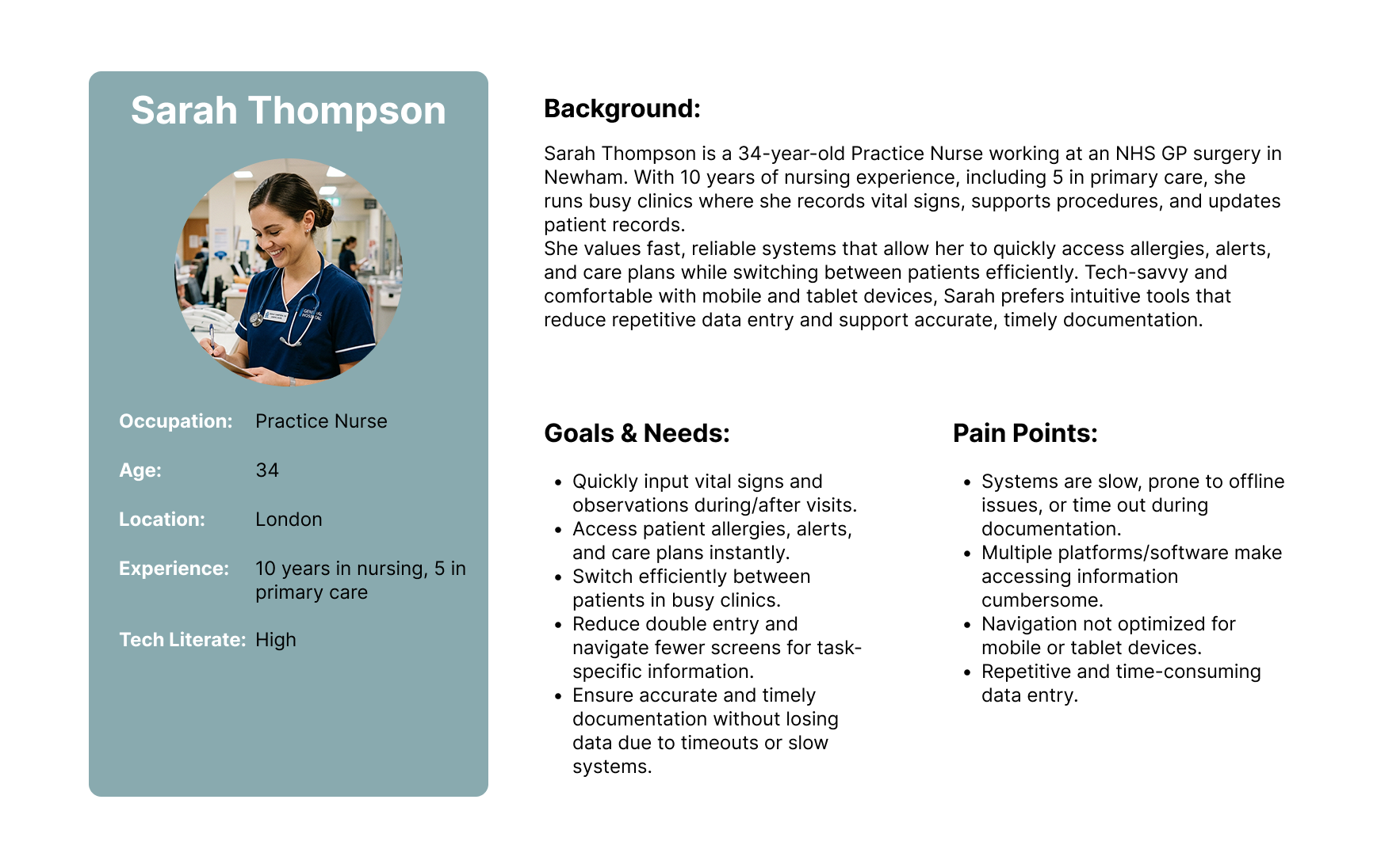
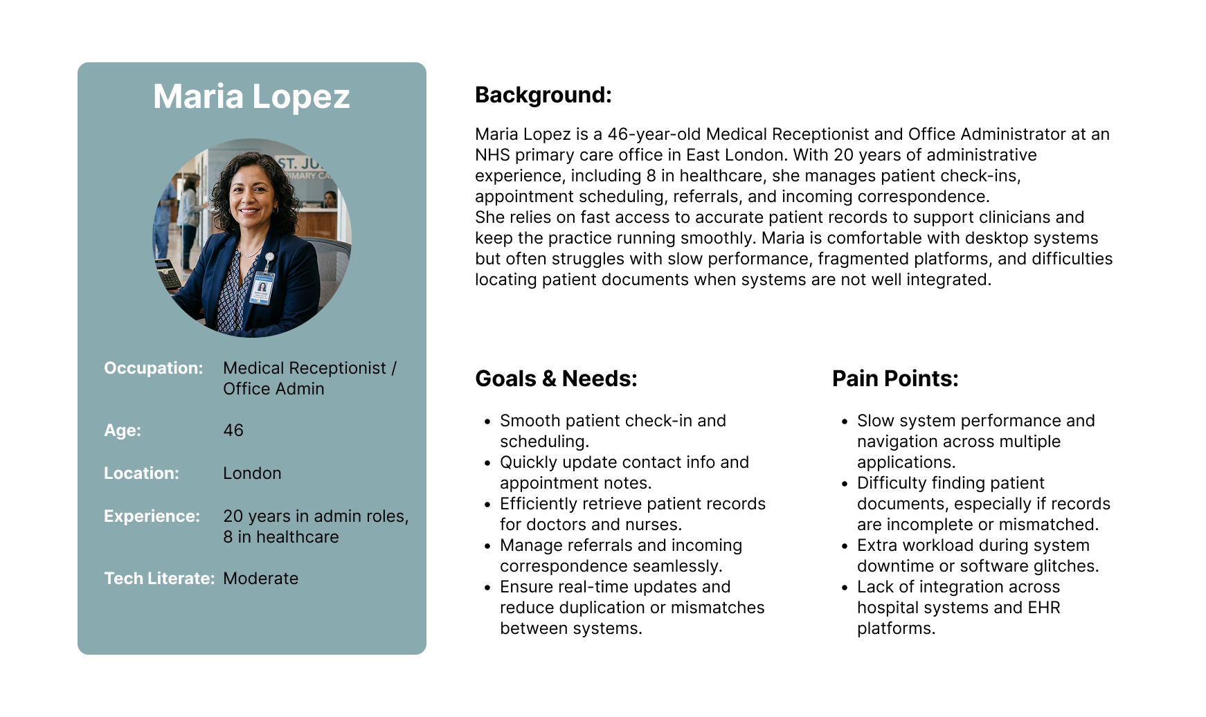
User Personas
Based on the insights gathered from my initial user research I created three user personas to represent the key users on and their needs. By synthesising these findings into realistic personas, I was able to better empathise with users’ frustrations and prioritise design decisions that address their core challenges. The personas served as a point of reference throughout the design process, ensuring that solutions remained user centred and aligned with real world needs.
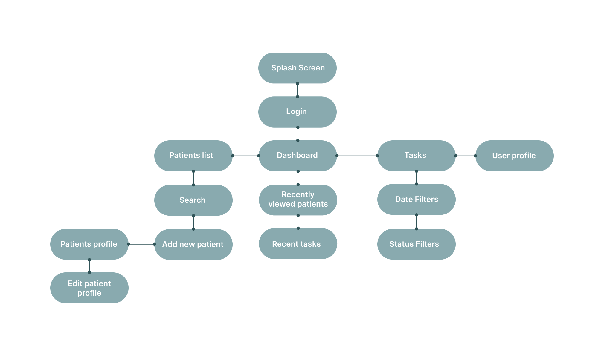
Information Architecture
Based on research, I designed the information architecture to reduce navigation steps and ensure critical patient data is accessible within one or two interactions.
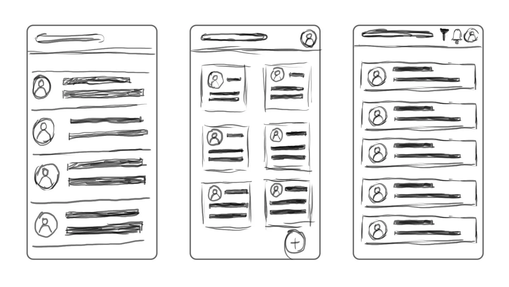
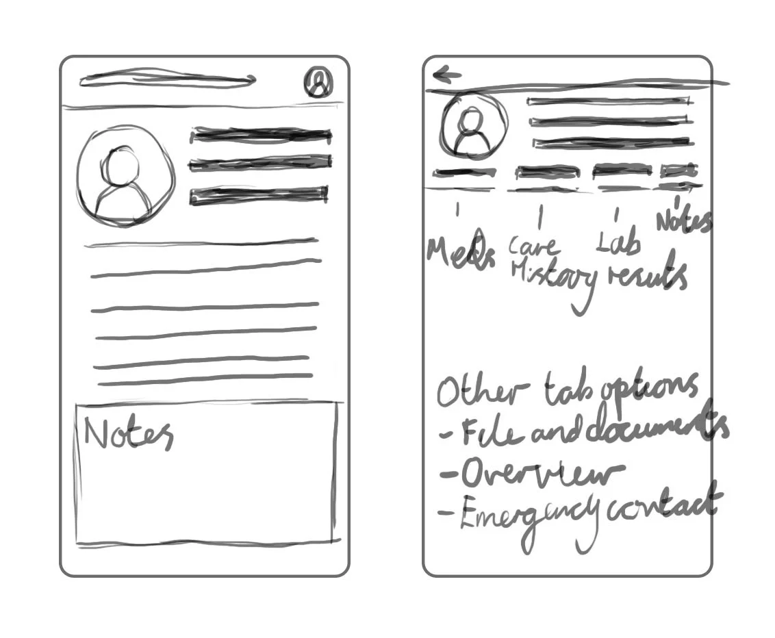
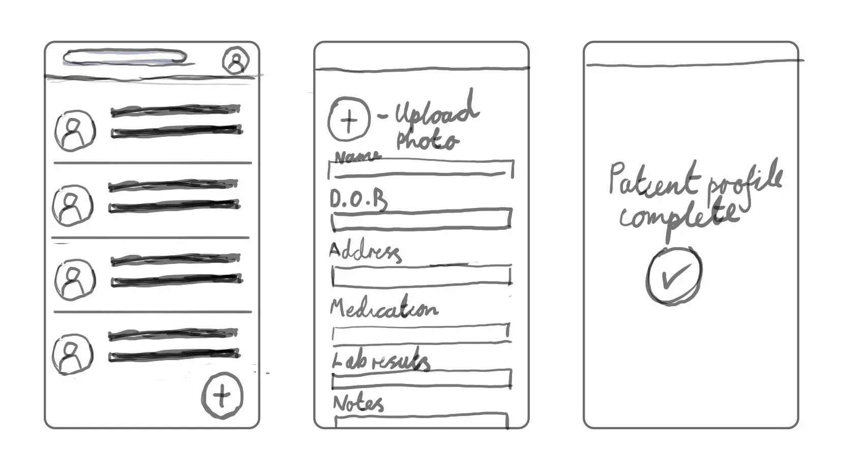
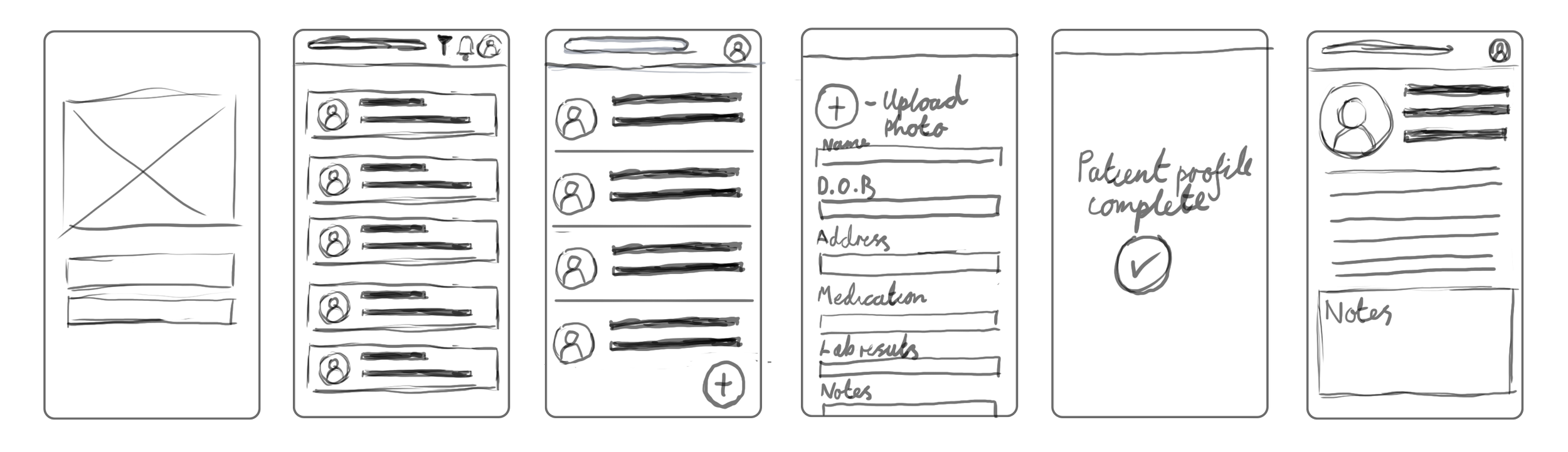
Initial Wireframes
I created multiple wireframe variations to test different ways of organising patient data and reducing navigation complexity.
Lo-Fi Wireframes
Once I was happy with my initial wireframes I then decided to put my sketched into Figma and refined those initial concepts into a more structured and interactive format. Building on the early sketches, this stage focused on improving layout consistency, navigation, and overall user flow. These wireframes allowed for clearer visualisation of the app’s functionality and provided a foundation for usability testing and further iteration before progressing to high-fidelity designs.
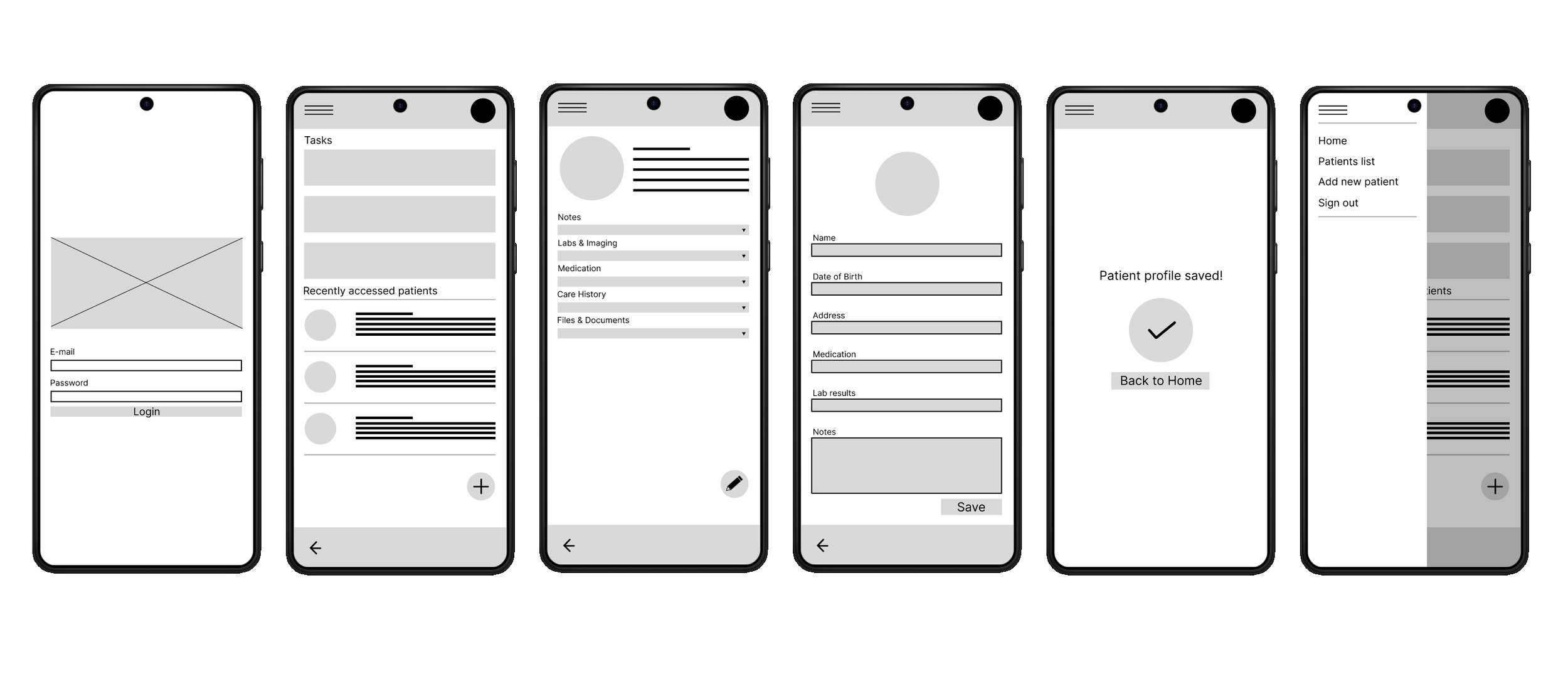
I created a prototype to demonstrate the basic user flow and core functionality of the app. At this stage, the focus was on simulating key interactions and navigation paths, allowing for early testing before incorporating it into the final design.
This prototype demonstrates the core user flow: logging in, accessing patient records, and adding a new patient profile.
Navigating between dashboard and patient records
Viewing structured patient information
Adding and saving new patient data
This prototype was used to validate navigation flow and ensure users could complete key tasks efficiently before moving to high-fidelity design.
Usability Study
After the creation of the low-fidelity prototype I conducted an unmoderated online user testing using Useberry, I had a sample size of 10 participants. The sample consisted of a mix of healthcare professionals in a primary care environment.
The study was conducted remotely, by using Useberry’s features allowing participants to go through a series of predetermined tasks within their own time.
After receiving all of my result from the usability study, these were the key findings I noticed from the results from the study.
Finding 1
No ‘Forgot Password’ link on the homepage
Finding 2
Users would much rather have the navigation menu to always be visible instead of hidden behind a hamburger menu
Finding 3
User have made it clear that patients key information should be visible on a patient profile card
Finding 4
Not easy creating/accessing notes or tasks
Hi-Fi wireframes
At this stage, I take all the participants feedback I had received from the usability study and use that to enhance the visual detail and consistency, of my current lo-fi wireframes while also addressing usability issues identified during the study. By incorporating user feedback, the designs became more intuitive and aligned with user needs, providing a more realistic representation of the final product.
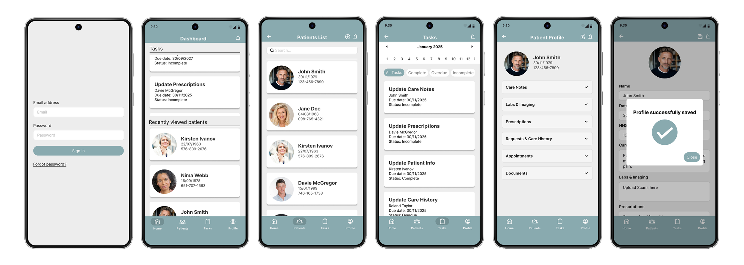
With the high-fidelity wireframe designs finalized, I then moved onto developing the high-fidelity prototype to provide a realistic and interactive representation of the final app.
Conclusion
Working on this project was very challenging and very insightful. It taught me a lot of what’s required to build a product from the ground up. It reinforced the importance of a user-centred design approach, particularly when working within complex systems such as healthcare. Through conducting user research and analysing pain points, I learned how valuable it is to deeply understand user needs before moving into design solutions. If I had more time I would have liked to try in person interviews to better emphasize with users and their needs for my initial research and usability study.
Overall, this project allowed me to grow both my design thinking and problem-solving skills, while emphasising the importance of designing with empathy and purpose.
Moving forward I plan to obtain UX/UI feedback from designers with more experience in the field to improve the overall design and functionality of the app. Once I have documented all feedback that was provided, I will make the necessary design updates in order to improve the app’s overall experience.